


Image: YouTube (video still)
Summary
- NASA creative director David Rager said in an interview that he has prohibited the use of AI imagery, explaining that NASA's brand is built on trust.
- NASA used James Modarelli's meatball as its official logo from 1959, switched to Danne & Blackburn's worm in 1975, returned to the meatball in 1992 and revived the worm as a supporting logo in 2020.
- The 1976 Graphics Standards Manual, which METAL counted page by page, runs 60 pages and orders that the logo never be redrawn but reproduced from original artwork. The Museum of Modern Art has added the worm and the original manual to its permanent collection.
The person in charge of NASA's brand has stopped the agency from using AI images. David Rager, NASA's creative director, said in an interview after speaking at Paradigms, a conference held in Croatia by the brand management platform Frontify, that "I prohibited using AI imagery." His reason fit in one line: "Our brand is built on trust." When people look at an image from NASA, he said, they need to understand that it is real and that they can believe what they see.
The decision carries weight because NASA's imagery is an asset built over 67 years. Even with a single logo, the agency changed course in 1975, reversed itself in 1992 and brought the old design back again in 2020. The two protagonists are the round insignia known as the "meatball" and the red lettering known as the "worm." To understand why Rager blocked AI images, it helps to see how NASA has guarded its own face.
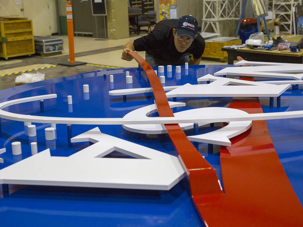
The story begins in July 1958 at a wind tunnel in California. James Modarelli of NASA's Lewis Research Center (now Glenn Research Center) was touring the Unitary Plan Wind Tunnel at Ames Research Center when he saw a model of a supersonic aircraft designed to fly at Mach 3.0. Struck by its cambered, twisted arrow wing and upturned nose, he stylized that wing into the NASA seal. Modarelli, who had joined as an artist-designer after graduating from the Cleveland Institute of Art in 1949, won the employee competition held when the National Advisory Committee for Aeronautics (NACA) was absorbed into the new space agency.
That is how the agency's official logo was born in 1959. According to NASA, the blue sphere represents a planet, the white stars represent space, the red V-shaped wing represents aeronautics and the orbit circling the name represents space travel. Modarelli simplified the formal seal, keeping only the stars, the orbit and the red wing, and added the letters N-A-S-A. The logo did not get the nickname "meatball" until much later, in 1975, when NASA decided to adopt a more modern design. In aviation, the U.S. Navy had already been calling the landing guide light on aircraft carriers a "meatball of light" in 1957.
In the 1970s NASA set this logo aside. NASA says it was hard to print and reproduce with 1970s technology, and many considered it a complicated metaphor for what was then a modern aerospace era. Under the Federal Design Improvement Program run by the National Endowment for the Arts, more than 45 federal agencies had their graphics reviewed, and NASA hired the New York design firm Danne & Blackburn. Richard Danne, the project's design director, recalled in an interview that "the meatball was complicated, hard to reproduce and laden with Buck Rogers imagery," adding, "Our logotype was quite the opposite: it was clean, progressive, could be read from a mile away."
The worm, unveiled in 1975, was a system rather than a single logo. The January 1976 NASA Graphics Standards Manual (NHB 1430.2), which METAL downloaded and counted directly, runs 60 pages and states that it took effect on January 1, 1976. The manual explains that the letters N-A-S-A were reduced to their simplest form, with strokes of a single width to evoke unity and technical precision. Removing the crossbars from the two A's gave the logotype a vertical thrust. The manual was adamant that the logo must never be redrawn but reproduced photographically from the original artwork.
The rules were almost obsessively specific. NASA red in four-color process printing was solid red plus solid yellow, and it was to be used only on white or very light backgrounds; on dark backgrounds the logo always had to appear in white. The manual listed nine incorrect uses, such as placing the logo inside a circle, showing it as outlined letters or standing it on a vertical axis. Helvetica was named the most important typeface, and the manual spelled out where and at what size the logo would appear on everything from vehicle front doors to aircraft vertical fins to the surfaces of spacecraft.
The manual reached far beyond the logo. Its contents are divided into nine parts: the logotype, reproduction art, stationery, forms, publications, signage, vehicles, miscellaneous and supplementary guides. The publications section sets out the uses of four typefaces, Helvetica, Futura, Garamond and Times Roman, with separate cover and interior grids for leaflets, journals, news publications, quality publications and case-bound books. It even covers news release formats, poster sizes and uniform patches. One clause says mission patches, with their distinct personalities and short lives, should occupy their own visual space apart from official identification so the two do not compete. It was not a logo change so much as a system binding every surface the agency showed the world.
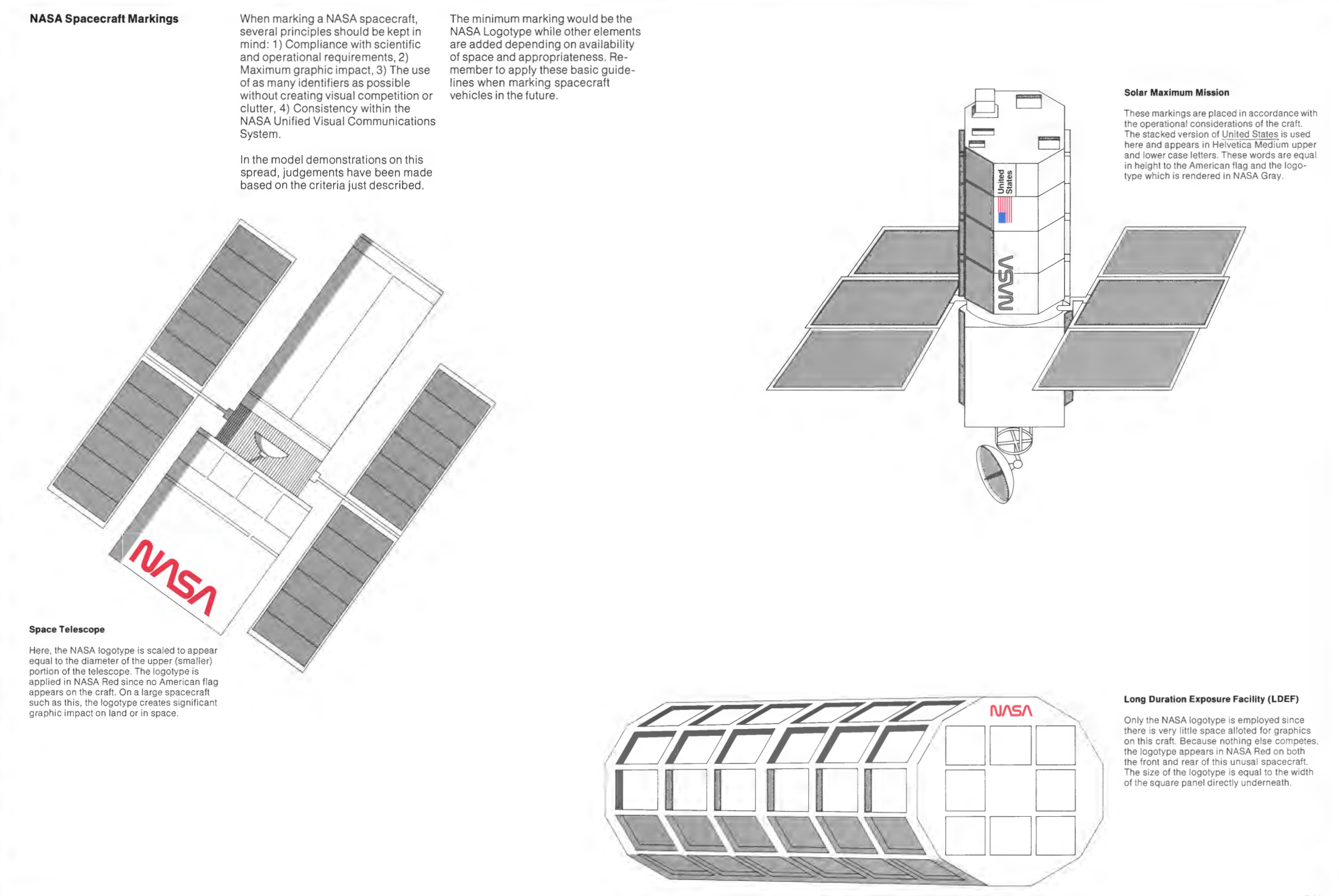
The spacecraft rules stand out in particular. The manual's spacecraft markings page says the logotype on the Space Telescope should be scaled to equal the diameter of the telescope's upper portion and rendered in NASA red because no American flag appears on the craft. The red worm was in fact applied to the surface of the Hubble Space Telescope. The manual listed its principles for marking spacecraft as compliance with scientific and operational requirements, maximum graphic impact, identifiers without competition or clutter, and consistency with the unified visual communications system.
The worm was pushed aside after 17 years, when Dan Goldin, who became administrator in 1992, brought the meatball back. NASA records that Goldin wanted to evoke the glory days of Apollo and show that "the magic is back at NASA." According to reports, Mina Wright Berryman, then director of the National Endowment for the Arts' design program, wrote to Goldin to object that "the worm is not simply a logo but an integral part of NASA's comprehensive visual standards programme," but the decision stood. Rager described it this way: the incoming administrator "didn't like it" and wanted to bring back some of the Apollo pride and energy.
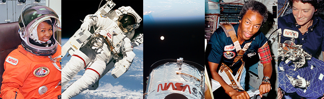
After that the worm retreated into souvenirs. NASA allowed it on merchandise again in 2017, and on April 2, 2020, announced "The Worm is Back." The logo was painted on the body of the SpaceX Falcon 9 rocket for the Demo-2 flight that would carry astronauts to the International Space Station. NASA called the flight the return of human spaceflight on American rockets from American soil. Even then, NASA drew a line: "the meatball will remain NASA's primary symbol."
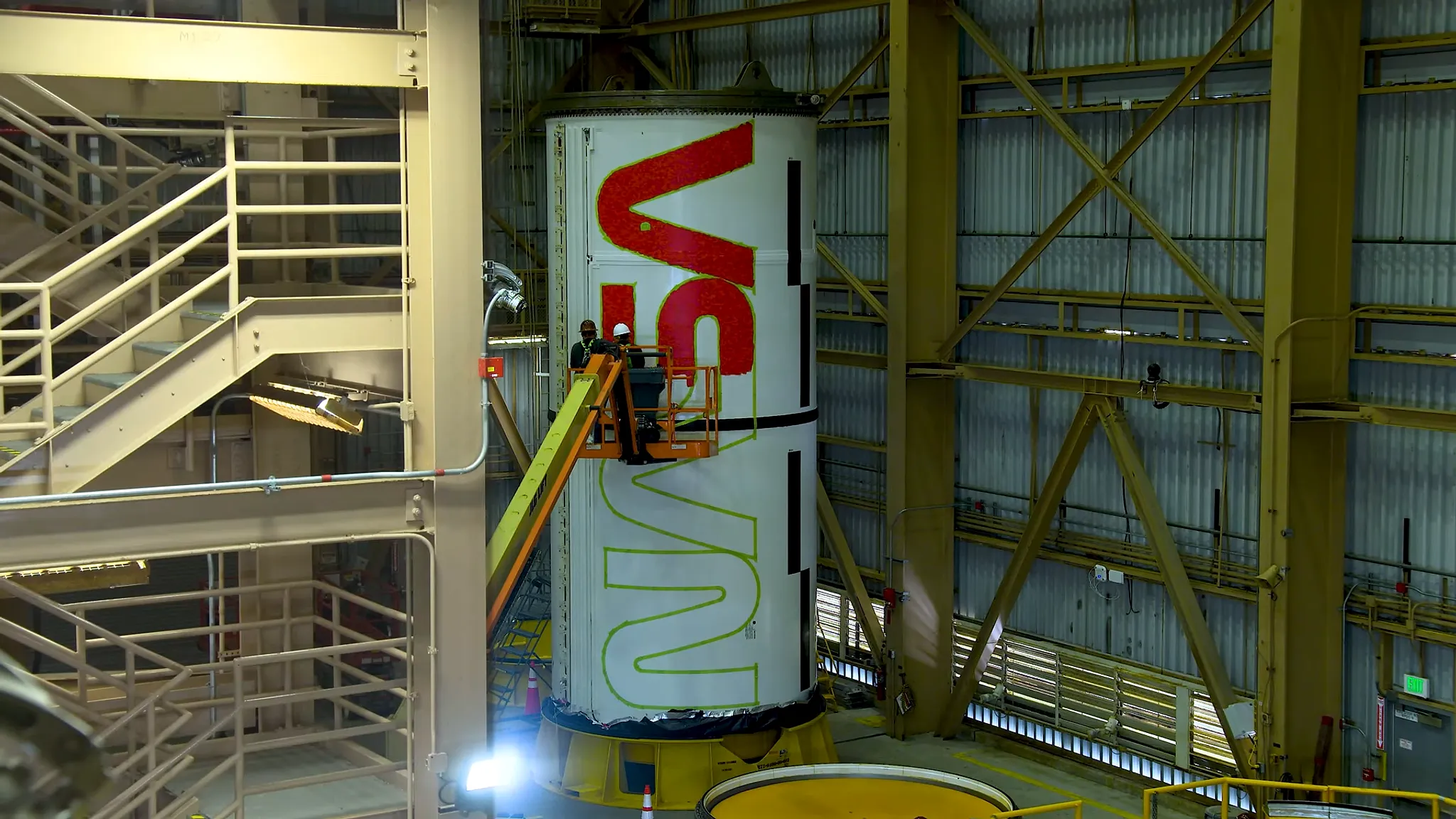
The worm then moved to Moon rockets. In November 2022 NASA used it on the Space Launch System (SLS), its first rocket around the Moon in more than 50 years. An official 84-second video from NASA's Marshall Space Flight Center, which METAL reviewed, shows the next chapter. Workers at Kennedy Space Center painted the worm onto the booster motor segments for Artemis II, the first crewed Artemis mission, from January 22 to February 16, 2024. According to NASA, each logo spans about 25 feet (about 7.6 meters), roughly the length of one booster motor segment, and the boosters, which stand 17 stories tall when stacked, display it on either side throughout launch and flight. The "maximum graphic impact" the 1976 manual demanded has been realized on a Moon rocket 50 years later.
Rager is the practitioner who brought the worm back. He got into design through playing in bands, worked in museums, at agencies and at Disney, and joined the Jet Propulsion Laboratory in 2019 after moving to a neighborhood right behind it. He went full-time at NASA Headquarters in 2023 after a major project to bring back the worm, and he said that for a year or so his job was "writing a peace treaty" between the meatball and the worm. NASA's current brand guidelines define the worm as a supplemental graphic to the meatball and do not allow it to appear without the meatball, except on merchandise.
Today's rules are as tight as those of 1976. Citing the U.S. federal regulation 14 CFR 1221, the guidelines require the meatball on all agency publications and displays, and bar outside organizations from using the meatball, the worm or the seal without permission. Among mission-specific marks, only two, Artemis and the James Webb Space Telescope, are approved for use alongside the meatball on public-facing materials. NASA's website uses three typefaces, Inter, Public Sans and DM Mono, and fonts that imitate NASA's logos are prohibited. NASA has also drawn a line against turning its imagery into NFTs. Its merchandise team reportedly receives hundreds of requests every month for permission to use its graphics.
Design history has called the worm back too. On November 6, 2023, NASA presented Richard Danne with the Exceptional Public Achievement Medal, given to non-government employees, and Danne called it "a culmination of a 50-year trek." The Museum of Modern Art (MoMA) in New York accessioned the worm logotype and the original 1976 manual into its permanent collection and first showed them in January 2025 in the exhibition "Pirouette: Turning Points in Design." Rager noted that the designer, now in his 90s, "never thought he would see it used anywhere again." In the NASA materials METAL reviewed, the year of the worm's presidential design award appears as both 1984 and 1985.
Seen against this history, Rager's AI ban reads as a principle rather than a preference. He said technically minded colleagues pushed back, arguing they did not need to ask for design help when they could simply generate something. His answer was that there are already enough people looking for excuses not to believe something is true, and "we don't need to fuel the fire." NASA's communications manifesto says it has to use something that exists first. "We have the kind of stuff that AI wishes it could make," Rager said. METAL previously reported on Claude building a navigation app from NASA lunar terrain data.
Conditions inside the organization also help explain the decision. Rager estimated that about 30% of NASA employees have only ever worked at NASA, and a similar share have been there 30 years or more. When people stay that long, he said, the brand becomes like wallpaper that no one notices. So he has run workshops and presentations across the agency explaining the two logos. Asked what NASA is selling, he answered not a product but "optimism and humanity." Because NASA is publicly funded, he said, the public needs to understand that it is a good investment.
Seen through the eyes of a content marketer, NASA's 67 years are a long case study in how a brand earns trust. The 1976 manual's order to never redraw the logo but reproduce the original, and the 2026 creative director's order to use existing photographs rather than generate new images, come from the same trust principle: only a reproduced original is real. In the AI era, as generated images become the default in advertising and social media, an agency that owns the red letters painted on Hubble and real photographs of real astronauts has chosen to reject that default. When anyone can cheaply make a convincing image, a brand's distinction shifts to proof that what it shows actually existed.
Sources
- Creative Bloq — "We have the kind of stuff AI wishes it could make": Why trust is more important than ever for the NASA brand →
- NASA — The Worm is Back! →
- NASA — NASA Brand Guidelines →
- Creative Review — How the NASA worm logo was designed →
- NASA — NASA's "Meatball" Logo →
- NASA — NASA Worm as Art →
- NASA — Worm Designer Receives NASA's Exceptional Public Achievement Medal →
- NASA's Marshall Space Flight Center (YouTube) — Artemis II Boosters Receive Iconic NASA “Worm” →

Comments